
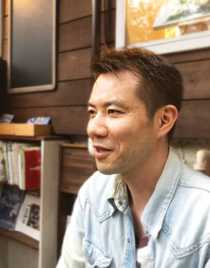
AMBASSADOR
ARTIST


- Career
- Born 1972, in Kanagawa Prefecture
1996 B.A. in History, Faculty of Letters, Komazawa University
2000 Graduated from Multimedia Art Academy, Background Art Department
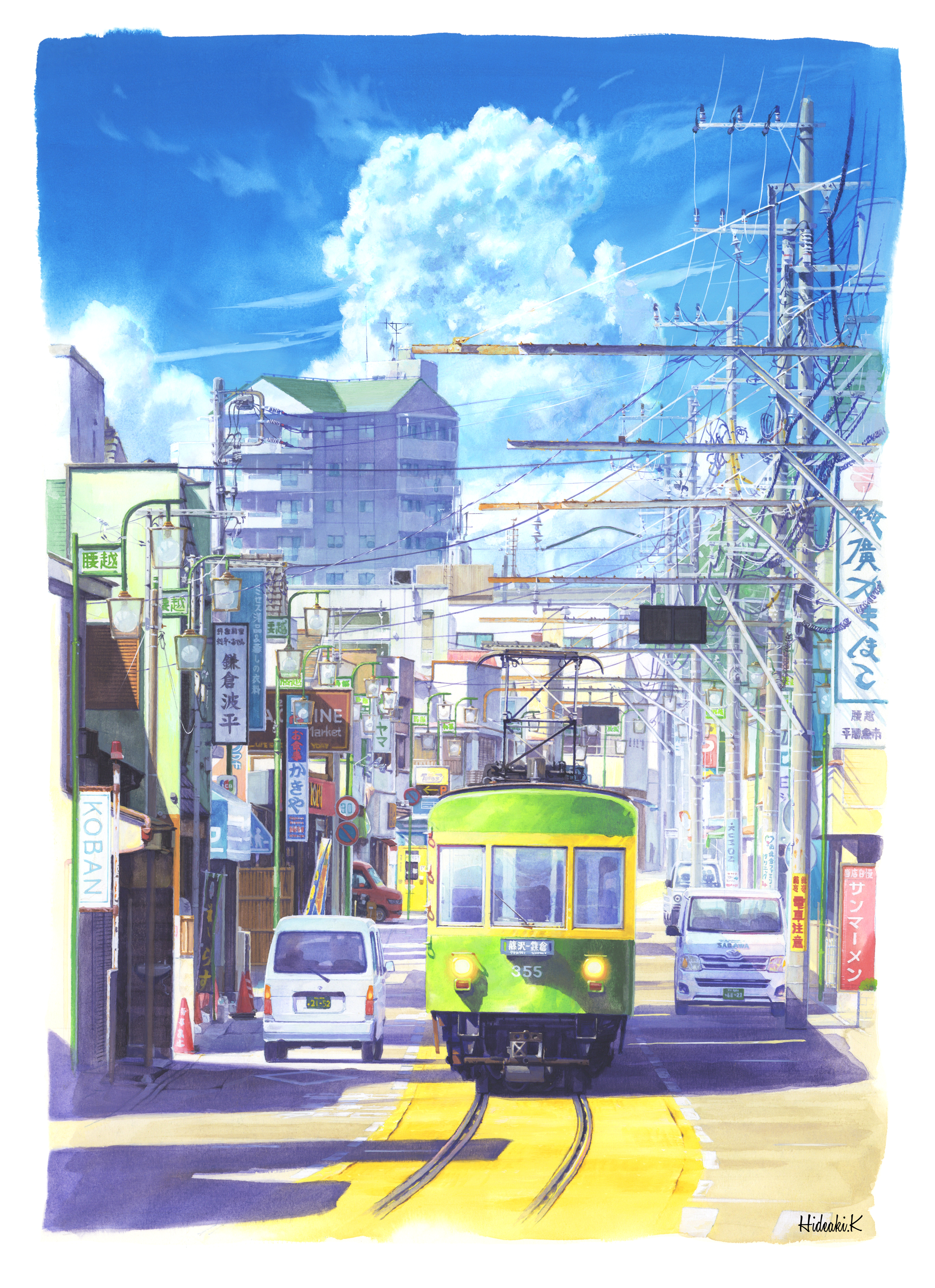
After working for a game company and an animation production company, he became a freelance artist. He is active in a wide range of activities, including solo exhibitions and watercolour classes, while painting local landscapes of Shonan.
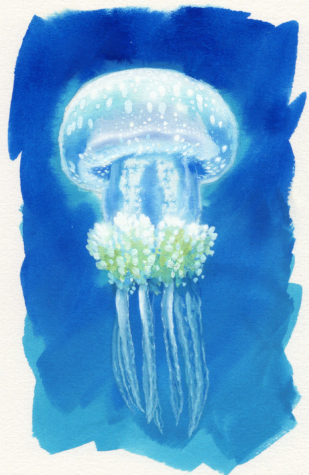
Although he doesn't currently work in the anime industry, he regularly holds large social gatherings for people in the anime industry. He is one of the most well-known faces in the industry. He also loves jellyfish and is known to be a jellyfish enthusiast.
No, the game company worked fully digital. I made everything in Photoshop.
That's right. I've been doing poster colours since I worked on anime.
When I was a student, we used MSX computers, but I really learned how to work with them until I joined a game company. It was the era from the Super Famicom to the PlayStation, I had a hard time because it was a very low-resolution pixelated picture and the capacity was limited. I also like to draw by hand. When I was a teenager, I used to draw manga characters.
I learned about traditional painting when I entered the academy. That's where I first encountered with NICKER Poster Colours.
It was very hard at first because I hadn't hand-painted in years, and I hadn't been taught to do it decently. I couldn’t even apply a gradient in a good way. Poster colours are difficult to use. I couldn't learn it in one year of academy, and it was only when I joined a background art company, I started to learn how to work with them.
Yes, that's where I learned to do the actual work. As a result, I've been there for 15 years.
If it's a background with only a pen drawing and a touch of color, I can do 4 or 5 pictures a day, but there are very few of such projects now. Many of them are very detailed, so I think I can only paint a maximum of one or two pictures a day now.
That’s right. I’m not just the only contributor, but I feel happy when I see my own work in the final product. Also, the tv shows, I worked on, are rereleased many times on TV, so there are many opportunities for people see my work. However, I'm working on my own projects now, so I feel differently about it.
But once you get used to it, it can be used for both transparent watercolour and acrylic style painting.
Many people reacted to the landscapes of Enoshima. Because it's my hometown I enjoy painting it even more. I prefer pictures with a mix of sea, sky, buildings, and vehicles than just natural scenery.
That's right. I used to receive the pictures from a photographer, but recently my drawings are based on my own photographs. I'm the type of person who draws from photographs and samples.
Not really. I don't use transparent watercolours either. I think poster colours are more difficult to handle than watercolours and oil paints. It's hard to get used to applying a clean coat of paint. Because it will dissolve in water. You learn from the daily experience and get intuition how to use it. It's hard to describe in words (laughs). It's good for detailed work, but it's hard to paint a large surface without being uneven.
But once you get used to it, it's a versatile paint that can be used in both transparent watercolour and opaque acrylic style. You can't get the opaque effect with transparent watercolours. By the way, I always use NICKER paints for poster colours.
I didn't have much chance to use other paints from the beginning, since NICKER paint is the most used paint for anime backgrounds. I think it's easy to dissolve in water and to be applied. Maybe it's because arabic gum is used in it. The spread of the paint is also just right when the paper is wet.
I use the Namura Taiseido's HBP flat brush and a sakuyo Japanese brush. The paper is MUSE's New TMK poster or Orion's Sirius paper. Most of the time I use TMK, but Sirius paper is a watercolor paper with a rough surface. I use it when I want to make a transparent watercolor style painting.
I'm currently working as an instructor at two art schools and at a nursing home for the elderly. I never had any experience teaching before, so it was a struggle. Especially when there are a lot of people, each person has a different level of understanding, so it was difficult to teach in the right order. However, once I could get into my flow, it became much smoother.
There are a variety of participants, both experienced and beginners. The brushwork is naturally better of those with experience, but even for people who have experience with acrylics, oil paints, or watercolours, poster colours are new to them. Poster colours may be difficult to use, but somehow, they were able to create a cohesive picture.
It's about balance, size and positioning, I think. Especially for clouds the shape and position is important. Don't draw too much. Don't make the shape that doesn’t exist. I'm not very good at plants either, but it's about the silhouette. Artificial objects are also silhouettes.
I'm pretty meticulous with my drafts, taking 1 to 2 days to complete. It's true that the sketches disappear when you draw over them and over again. So, some people just draw the silhouette. Poster colours are good for detailed work, so if you can get a good silhouette, you can paint the details later on with Poster Colours.
I have a lot of group exhibitions, so I want to have a solo exhibition, and I also have a lot of work as an illustrator, so I want to be more active as a landscape watercolour artist.
I've always liked to draw and to paint. After graduating from college, I worked part-time at a video game company, as a painter.