
AMBASSADOR
ARTIST

- Personal history
- Originally from New York, U.S.A.
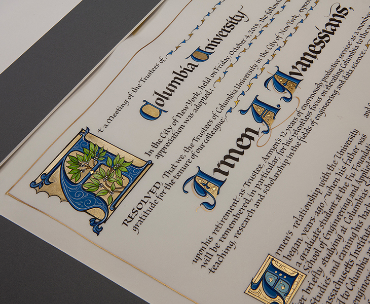
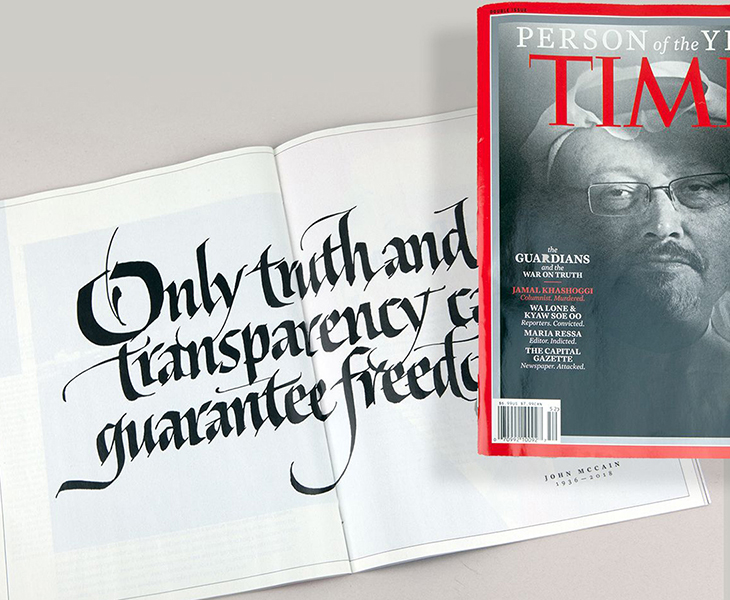
His work has graced Royal Mail postage stamps, book jackets, custom titles of magazines and newspapers, and posters and signs for libraries, museums, and churches. Clients have included Royal Mail (United Kingdom), TIME Magazine, New York Public Library, Lucasfilm Ltd. etc.
His original artworks are included in the collections of the San Francisco Public Library, Letterform Archive (U.S.A.), Akademie der Künste, Klingspor Museum (Germany), and La Casa del Libro (Puerto Rico), as well as in many private collections.
His works have been published and featured in dozens of publications and books in U.S.A., Australia, Europe, and Asia.
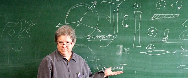
He teaches at many national and international letter arts conferences, and has taught in Japan.
He is also the author of the book “SCRIBE––ARTIST OF THE WRITTEN WORD” and upcoming “Mastering Broad Brush Roman Capitals.”
It seems you and your artwork are well known by the calligraphic community in Japan.
It was kind of you to have accepted to appear in the Japanese T.V. show, “Wafusohonke,” in 2017 to introduce our company. Watching the video of your demonstrating, we were so impressed with your excellent brush control. When and how did you learn such techniques?
When I was young, I was interested in two things: art and music. In my childhood, I often copied those illustrations in the encyclopedias. During the summer break at the age of 13, one of my friends loaned me a guitar, and I practiced it day and night by myself. I’d never played one before, but by the time we were to return to school in September, I could play it pretty well, and I started to dream of being a musician. I was good at learning by listening to radio and records. This ability was known as “playing by ear”–– but I later taught myself to read music. I played in several bands and privately continued doing my artwork.
A. For the things I like, yes!
Then, in my twenties, my father introduced me to a friend of his who had a sign shop, and I was able to apprentice under him. Later I realized how lucky I was; he was a very talented and knowledgeable sign painter.
For a few years, I was making my living as a sign painter. I worked hard and learned a lot from him, mainly professional craft and methods. Eventually, I investigated typography and discovered that many great type designers were, in fact, calligraphers. So, I studied calligraphic letterforms and the theory of letterform mostly on my own, from books. My experience of practicing the guitar myself helped me a great deal. I frequently visited the New York Public Library, borrowed lots of precious books of letterforms, and studied carefully. I did take an occasional class but found I could accomplish a lot on my own on my time (while working as a sign painter.) I was striving for excellence, and I was insatiable in reading and practice. People thought I lost my mind.
I studied design theory as well. I think music taught me a lot about the abstract side of art and design. Anyway,” He took to it,” as they say.
I eventually left the sign business and became a graphic designer and hand-letterer, which includes drawn letters for custom typeface and calligraphy.
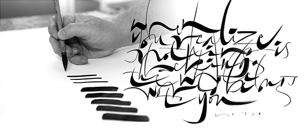
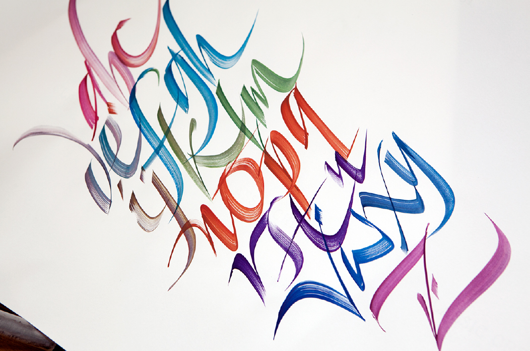
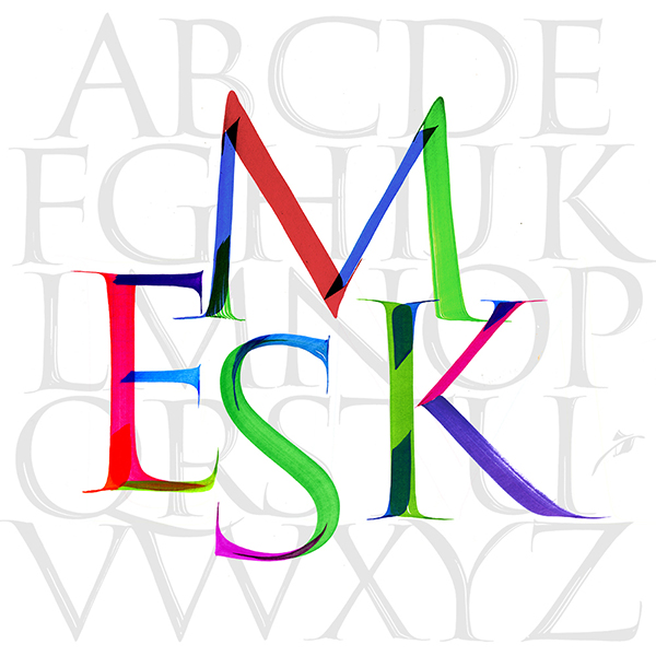
Back to your first question: Both sign painting and calligraphy require techniques and mastery with tools; especially to be good with a brush (as many people in Japan know). Mastering the brush requires hours of practice, and some keen, insightful observations to understand it. I have tried and worked with every type of brush. There are subdivisions of specialties; Writing letters, painting letters, and drawing letters each require a slightly different skillset.
And brushes work differently with different paint, or on different surface. So, we have to learn to control each tool according to what we are working on.
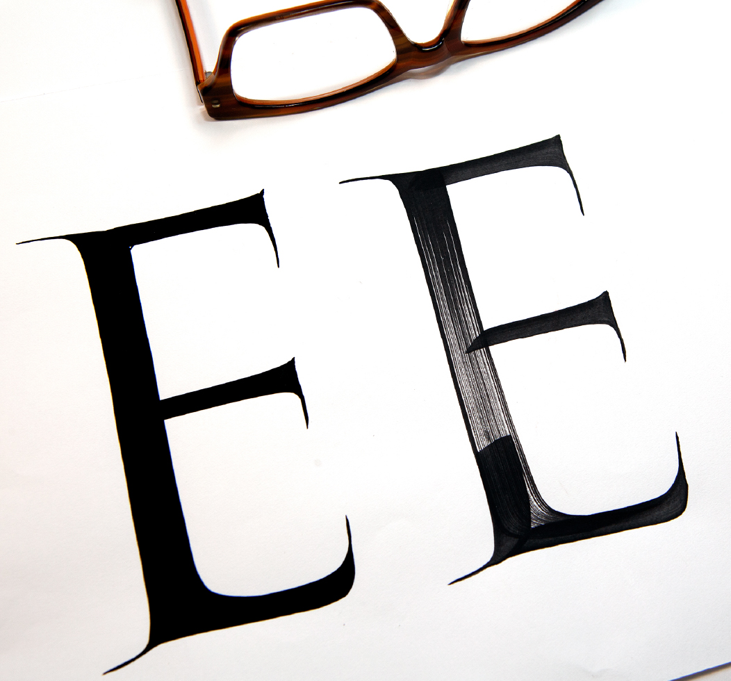
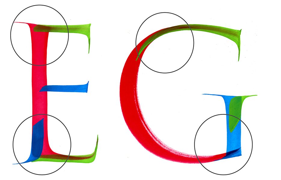
The color is dark and not broken.
Also, could you tell us anything you can advise to calligraphers about the right way of practicing broad-brush writing?
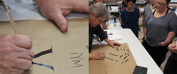
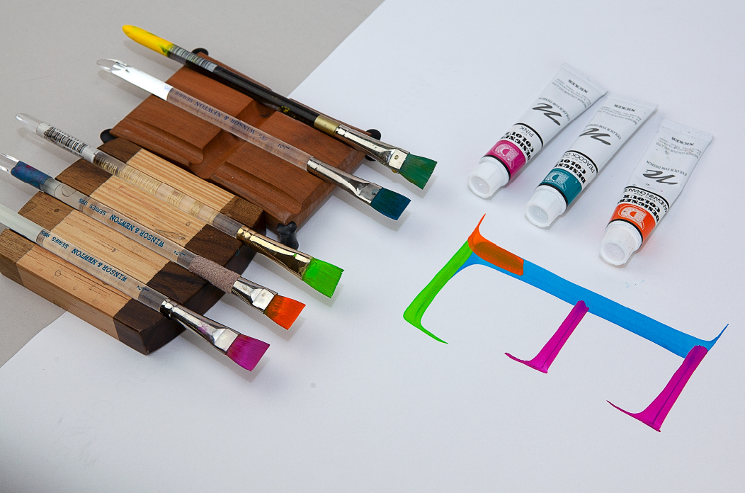
It can be said about any paint, but we need to know how much we dilute the paint, and it has to be consistent. With NICKER POSTER COLOUR, because it is soft and easier to control, I wait for a second for each stroke to set up and then make the next stroke. No rush, that is the key, also.
By the way, the colors of those overlapped parts are still not bad, right?
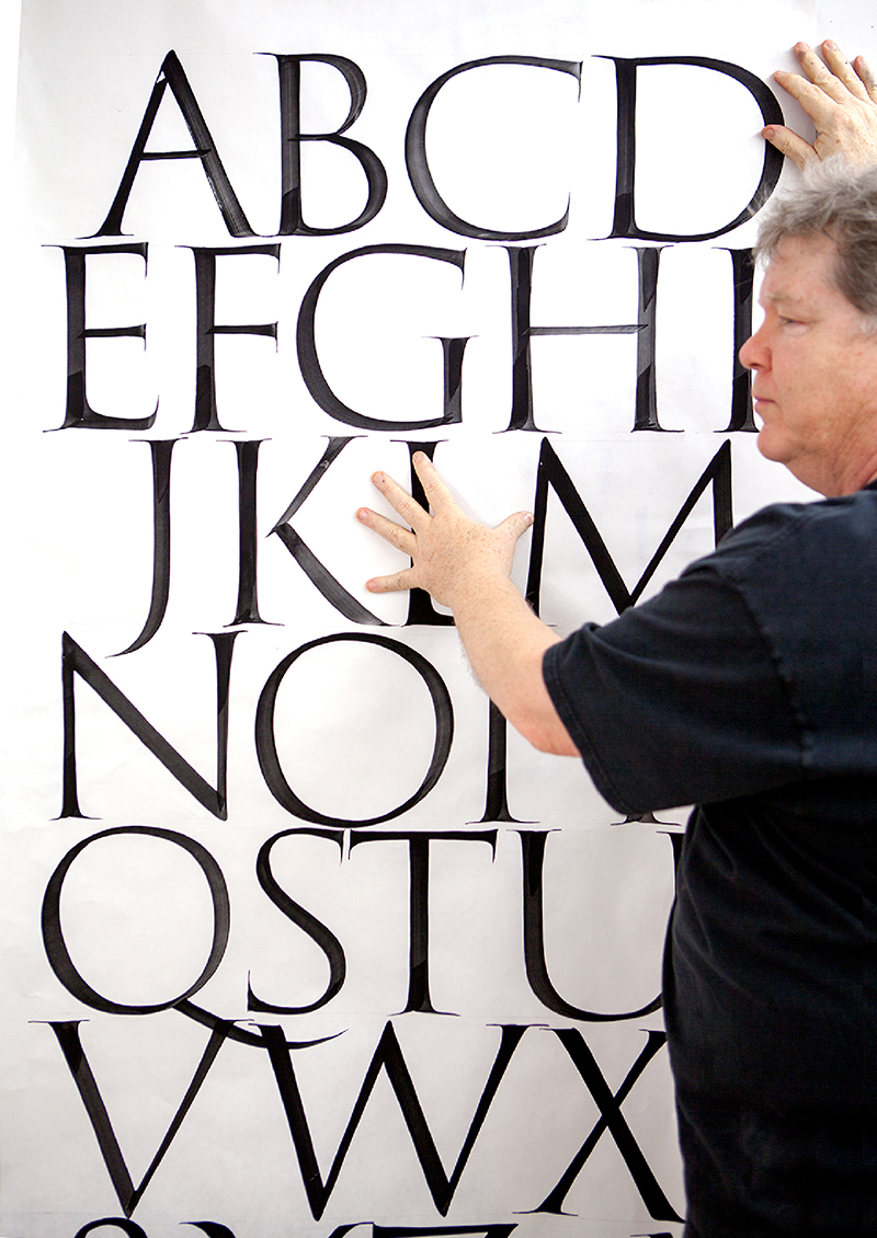
When we write Roman letters with a broad-brush, strokes must overlap. And they must overlap precisely. Therefore, I need to show it to my students clearly how those strokes overlap.
Now I am in the process of publishing a book about brush Roman Capitals. I wrote each Roman alphabet using five POSTER COLOURS in five different brushes so that people can see each stroke and how they overlap. I am quite happy with the result.
As far as advice: (that’s why I am writing a book!) But, in short, have a good model in front of you and focus on key letters. How will you know that? It depends on the hand (style), but generally the I, O determine the verticals and curves. Then in Italic, you want to see how the letters join. Strive for rhythm over perfection, and try to be mindful of margins on the page (instead of random writing all over the sheet).
In this age of digital everything, it is vital to have quality artists’ materials.
I am so glad that Nicker has an interest in making a great product and in listening to what a calligrapher like me has to say about it. Craftsmanship supports artists, and I am grateful for that. I am thrilled to have an ongoing relationship with Nicker and wish lots of success and that they keep making quality materials.


Yes, as you mentioned, after researching for a long time, I fortunately encountered the Nicker paint.
A quality product is essential and always a pleasure for artisans and artists to use. The real powerful black color paint, in which I can control thin lines and smooth flow, are reasons I always value good materials.
It started with the Black. The Nicker paint flows well, very dense in colors, and plentiful. And it dries perfectly matte.
I also found it is easier to mix colors and make the exact color I want in some cases. I once played with those three primary colors of POSTER COLOUR, mixed them roughly on my palette, and could make all of those nice colors with hardly any effort.
POSTER COLOUR is beneficial for beginners; to handle and to do brush calligraphy, as it is softer than normal gouache, one can control the paint easily. So, in my Brush calligraphy seminars, all the students practice with POSTER COLOUR instead of gouache because of ease of use, opacity and fluidity.
Since then, we have introduced this find to our leading supplier here in the U.S... Now John Neal Bookseller and Nicker have a connection so other American calligraphers can acquire this color.